
A logo is 1% of what customers see. What a brand system includes beyond the logo: identity rules, colour tokens, type, motion, voice and components.
There is a conversation I have at least once a month. It starts the same way every time. We need a new logo. And then, ten minutes in, it becomes clear that the logo isn't the problem. The brand is. Or rather, the system that holds the brand together, the one that doesn't exist yet.
A logo is a symbol. It points to something. It is not, in itself, the thing it points to. When someone tells me they want a new logo, what they usually mean is: we want people to perceive us differently. And no symbol, no matter how clever, can do that on its own.
This used to be a niche complaint, the kind of thing brand consultants muttered to each other at conferences. It isn't anymore. The shift to software-mediated business has made it operationally true. If your customers experience your brand primarily through a product, a dashboard, an email, a checkout flow, then the logo is maybe one percent of what they actually see. The other ninety-nine percent is the system surrounding it. And most companies do not have one.
What a brand system actually is
I want to be precise about this, because the phrase "brand system" gets used loosely. People say it when they mean style guide. People say it when they mean Figma library. People say it when they mean "the file with the logos in it on Dropbox." None of these are brand systems. They are inputs to a brand system, at best.
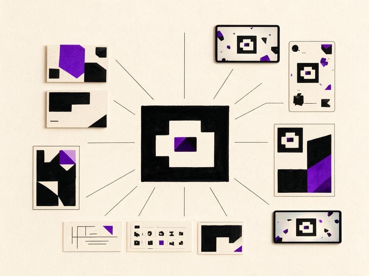
A brand system is the set of decisions that, taken together, make every brand touchpoint feel like it came from the same company. It is opinionated. It is enforceable. And critically, in 2026, it is machine-readable.
Concretely, a working brand system includes:
- Identity primitives: logo lockups, monogram variants, clear-space rules, minimum sizes, and the rare cases when each variant is correct.
- Color tokens: not just a hex code per role, but a semantic model, primary, surface, accent, text-on-color, error, success, exported as JSON or CSS variables that engineering can consume without translation.
- Typography scale: a finite set of type roles (display, body, label, caption, mono) with weights, line-heights, tracking values, and responsive scaling rules. Not "use Inter at 16px" but "this is
body/m, used here and here, and the design files reference it by name." - Motion grammar: how things move, what easing curves you use, how long transitions last, when motion is appropriate. This is the most-skipped category and arguably the one that does the most to make a brand feel coherent in software.
- Voice rules: not a tagline. The actual rules about how you write, how you handle numbers, what tone you take in error messages, when you use contractions, whether you address the user by name. Engineering writes microcopy all day; without rules, every developer writes in their own voice and your product reads like four different companies stapled together.
- Component library: the visible UI patterns, buttons, inputs, cards, alerts, that consume the tokens above and apply the voice rules. Built in code, not just in Figma.
When you have these, you have a brand system. When you have only some of them, you have a moodboard with extra steps.
Why the old model breaks
The traditional brand identity deliverable, the hundred-page PDF, was built for an era when brands were mostly applied by humans. Print designers needed swatches. Marketing teams needed rules. Sign painters needed dimensions. The PDF was the bridge between the brand and the people executing it.
In a software business, the people executing your brand aren't designers. They're developers. They are reading from a CSS file, an iOS asset catalog, a Tailwind config. If your brand only lives in a PDF, the PDF gets translated, badly, into code. Once. By one developer. Three years ago. And then nobody touches it, because nobody wants to be the one who broke the homepage.
The PDF model also breaks because it assumes the brand is stable. In a healthy software company, the brand is being applied to new surfaces every quarter, a new product feature, a new landing page, a new email template, a new internal tool. If the brand system isn't where the work happens, it doesn't get applied to the new surface. The new surface gets its own ad-hoc styling. After two years, your "brand" is a graveyard of one-off decisions that nobody remembers making.
The asset that lasts is the one that lives where the work happens. A brand that lives only in a Figma file dies the day no one opens that file.
Design tokens, briefly
The mechanical answer to all of this is design tokens. The concept is simple: every visual decision becomes a named variable, stored in a single place, consumed by both design and engineering. When you change the variable, everything downstream updates.
A token isn't #4A1D96. A token is color.brand.primary. The hex sits behind the name. If you later decide the brand primary should be a shade darker, you change one value and every button, link, accent, and chart updates everywhere. Without tokens, you are searching codebases for hex strings. I have done this. It takes a week and you still miss six.
Tokens come in layers. Primitive tokens describe raw values: color.violet.500, space.4. Semantic tokens describe roles: color.surface.subtle, color.text.muted. Component tokens describe usage: button.primary.background. Brands that ship software well tend to invest in the middle layer, semantic tokens, because that's where intent lives. "This is the muted text color" is portable across themes, across dark mode, across product surfaces. "This is purple-700" is not.
Voice as part of the system
Visual systems get most of the attention because visuals are easier to argue about. But the part of a brand that customers actually retain, what they tell their friends, what they parrot back to your sales team, is the voice. And voice is a system.
Voice rules sound silly when written down. Don't use exclamation points unless something genuinely warrants celebration. Numbers under ten as words; ten and above as digits, except in product specs. Never apologize in marketing copy; always apologize in error states. On paper, this is bureaucratic. In practice, it is the difference between writing that sounds like one company and writing that sounds like a Slack channel with too many participants.
The studios that get voice right write it down and audit against it. The ones that don't say things like "our voice is friendly but professional", which is, as a rule of thumb, the brand-voice equivalent of "we have a logo."
Motion: the silent half
If your product moves, motion is part of your brand whether you've designed it or not. The default browser easing curve, the default React transition, the default iOS spring, these are all somebody's design opinions. If you haven't replaced them with your own, you are using theirs.
Motion grammar means: deciding what eases you use (probably one or two custom cubic-beziers), what durations are normal (a small finite set), what kinds of motion you allow (entry, hover, sustained, exit), and what motion is forbidden (probably most pop-in effects, probably bouncing). Then you write these down. Then you enforce them.
The brands that feel premium in software almost always have considered motion. The brands that feel cheap almost always have either too much motion or too much default motion. There is no middle ground that isn't somebody's deliberate choice.
How to start, if you have nothing
If you are reading this and realizing your company has none of this, the move is not to commission a brand system from scratch. The move is to start documenting the decisions you have already made.
Open your product. Open your website. Open your last three marketing emails. Make a list of every distinct color, every distinct font size, every easing curve, every voice quirk. You will discover, painfully, that you have more decisions than you thought, and most of them are accidental.
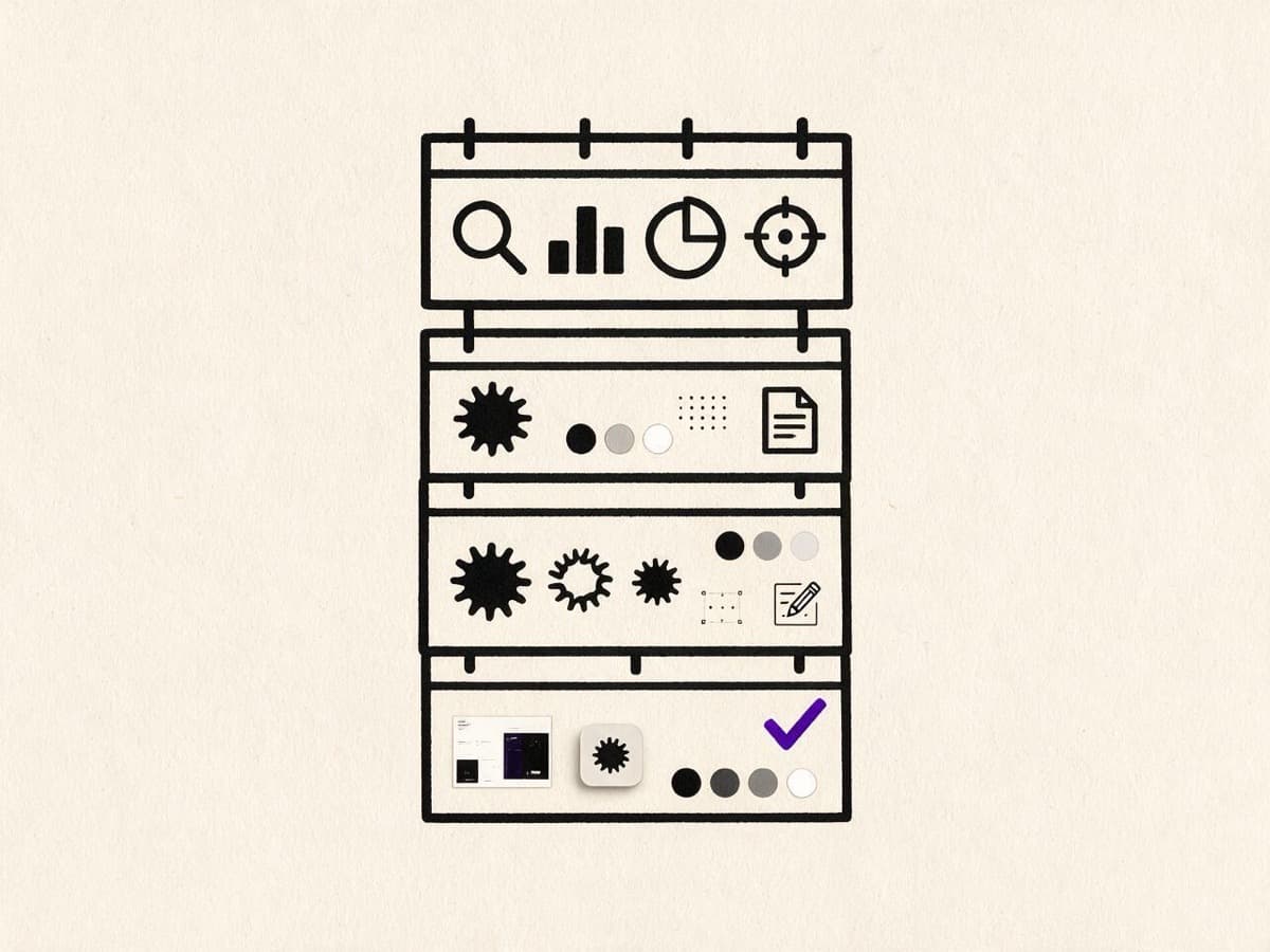
That list is your starting brand system. From there, the work is reduction: consolidate redundant decisions, name the survivors, exile the rest. After three rounds of this, you have something you can put in a token file and ask engineering to consume. That is the moment your brand stops being a folder of images and starts being a system.
What this gets you
Brands that operate as systems compound. Every new surface adopts the existing tokens. Every new feature reads the existing voice rules. Every new email uses the existing motion grammar. After two years, the brand is more coherent than it was at launch, not less. After five years, it has the property that strangers can identify it from a fragment, a button hover, a notification sound, a font in an error message.
That property, the ability to be recognized from a fragment, is the only durable definition of a brand I have ever found useful. And you do not get it from a logo. You get it from a system that holds together, deliberately, across every place your company speaks.
If your brand is still a logo in a folder, this is the year to fix it. The brands that ship the next decade of software are not going to be the ones with the prettiest marks. They are going to be the ones with the best systems. Quietly, in code, where nobody sees them, and yet everybody feels them.
Frequently asked questions
What is the difference between a logo and a brand system?
A logo is a symbol. A brand system is the full set of rules for colour, type, motion, voice and components that makes every screen, email and document recognisably yours.
What should a brand system include?
Logo lockups and clear-space rules, semantic colour tokens, a typography scale, motion rules, voice rules with examples, and a component library in code that engineering can use directly.